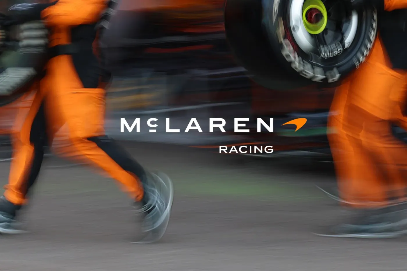
McLaren is stripping back its modern veneer to reconnect with its garage-built origins, revealing a streamlined corporate wordmark that defines the aesthetic of its future production vehicles, merchandise and digital footprints. This visual overhaul pulls directly from the signage that hung outside a family-owned service station in Auckland, New Zealand. Run by the parents of company founder Bruce McLaren, that specific garage is a foundational piece of motorsport history. The location served as the site where a young Bruce modified a 1929 Austin Seven before driving it to his first motorsport victory at Muriwai Beach. By reviving the typography that oversaw that historic workshop, the brand anchors its contemporary hypercar lineup to the hands-on legacy of its namesake.
The redesigned branding replaces the previous mixed-case badge with an assertive, all-uppercase layout utilizing a custom font named McLaren Sans. A distinct horizontal line placed squarely beneath the letter C defines the refreshed wordmark as a direct nod to the original Auckland signage. Despite these sweeping typographic changes, the automaker preserves its most recognizable visual assets. Designers retain the iconic Speedmark logo to appear alongside the new text and preserve the Speedy Kiwi graphic to honor the company’s New Zealand roots. To complement the updated lettering, the automaker introduced a nostalgic corporate color palette that includes Papaya (orange), Ember (reddish-orange), Midnight (blue), Black, Anthracite, Colnbrook (silver) and Mist (white). Every hue in this updated spectrum was sourced from a single vintage photograph of Bruce McLaren resting on the tire of his single-seater race car.
This visual rebranding creates a singular expression that bridges McLaren Automotive and McLaren Racing. Unifying the road-going and track-focused divisions under one historical aesthetic sets the stage for a new era of brand engagement. Executives confirmed that this visual alignment accompanies a push toward deeper personalization options and more immersive community experiences for owners and fans. Under the guidance of Chief Creative Officer David Woodhouse, the design pivot emphasizes the historical legacy of the founder to establish a cohesive global identity. By aligning the modern showroom floor with original motorsport pedigree, the automaker leverages its heritage as a core cultural offering that transcends pure vehicle performance.
The transition between the old and new visual eras is already underway on the tarmac. As a closing chapter for the previous aesthetic, the upcoming McLaren W1 flagship is expected to be the final new model to roll out of the factory with the old mixed-case logo. Meanwhile, the public caught a subtle preview of the incoming design language during Monterey Car Week last August. A hint of the custom font initially debuted between the taillights of the McL 6GT manual V8 supercar. Following the official announcement, the placeholder lettering on the back of the McL 6GT has been formally replaced by the full McLaren wordmark to mark the start of a heritage-driven future.